Following up on our previous article we will now try to take a dataset and actually assess the value of the data within. The beauty of a census dataset is that it's about things that are relatable to us all: people and places.
We will start with the dataset we created and using the techniques in the previous articles we will now enrich our data with visual geographic information, which will allow us to actually see what and where the data we're analyzing actually is.
You will find the data at https://www.istat.it/it/archivio/104317 under "Basi Territoriali" section "Sezioni di censimento – formato xls e shp", we will need the WGS 84 UTM Zona 32n data for each of the 20 Italian administrative areas.
Once you got the data in a folder and the input properly set, let's join it by the "SEZ 2011" code and put a browse tool after the join. What you should get after running the workflow is this:
Italy is pretty densely inhabited so what you get is a map with a few small "holes" in it.
Now, this is nice to look at but not very informative if you need to do something meaningful with it.
Now, we have a lot of fields, so analyzing them one by one would take ages! Fortunately, Alteryx comes again to the rescue, let's see how.
We're going to use two tools from the Data Investigation section: Basic Data Profile and Field Summary. Connect them to our join, select all fields inside and add Browse tools after the outputs.
Let the workflow run, sit back and relax while software does this piece of work for us, it will take a few minutes unless you're using a recent workstation grade machine or something more powerful.
Basic Data Profile will output a list of useful values for every field, which will allow you to have a basic idea of how the data is statistically distributed and if there are basic issues to deal with:
In this case, what we can see about this field is for example that we are dealing with an heavily skewed distribution, where Average is over twice the Median. In layman terms, this means that while there are areas with relatively few buildings, they tend to be a minority and there likely are some outliers that heavily skew the distribution and all in all we'll see some wildly different areas in Italy!
Field Summary instead tends to display fewer informations but if you use the interactive output report it will be more user friendly. Let's see the same field as before:
As you can see, most areas have between 0 and 100 buildings but the outliers have a lot more!
Let's remove our data investigation tools and check those extremes more closely, using a filter on the "Abitazioni occupate da almeno una persona residente" field set to the maximu value we found (2057) and adding a Browse tool after:
The map tells us it's between a river and a highway plus a few street names, while the data tells us where it is: Fiumicino, located in the Roma province, near the Italian capital.
How is this useful? For example, if our requirement was to find relatively small areas where to send mail advertisment (not as common today as 10 years ago but not that rare either), this could be an excellent candidate.
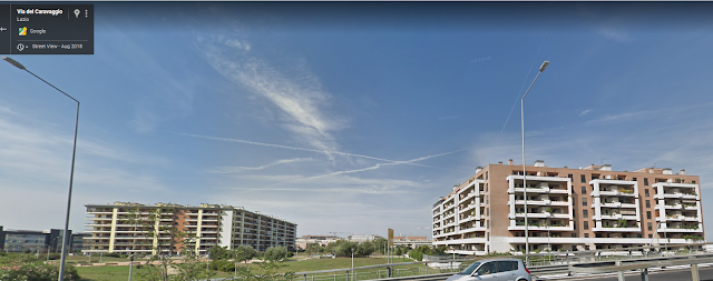
This is not some dry data, this is a real place, so let's be curious and take a look at it in Google Street View:
Looks like we hit an area with pretty big apartment complexes, so a place where you could reach a lot of people with little effort indeed!
Looking deeper into the data, we see that it's just over 4000 people, with roughly 65% of them over 15 years old and employed. This is a good starting point, but maybe not enough for a big campaign.
To do this, let's find out the top 10 most populated areas, checking how many people we could potentially reach and where they are:
Using the Sort tool in the Preparation tab we'll sort by "Popolazione Residente - totale" in descending order and using the Sample tool we'll take the first 10. Finally, we'll use the Summarize tool to see total, average and median population of our top ten.
As you can see, by getting the most popolous areas we got almost 50 thousand people, all of them in relatively small areas so very efficient to reach.
Finally, where are they again?
Looks like Milano, Livorno, around Rome, Naples are our candidates!
If we wanted to focus just on a limited geographical area looks like the area around Rome has roughly half of the most popolous census areas.
With relatively little work, we managed to create a preliminary analysis but definitely not enough to rest on our laurels! Finding lots of people is easy and good, but are they the right people? To see if they are we'll need a deeper dive into the data, which will be our next article!


No comments:
Post a Comment